My first photo for this week is by the photographer Bruce Davidson. This particular photograph is from his series Wales & England and is titled Wales. 1965. I chose this image for it's contrast and minimal subject. While the subject s surrounded by tons of detail it only seems to enhance the image and emotion you get from it. The image depicts a young girl in a graveyard and I feel that the way the subject was handled kept the photograph from being cliche and disinteresting. To see more of Davidson's work click here.


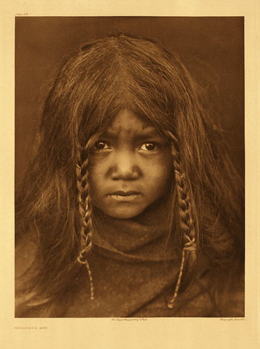
My second image is by the photographer Edward S. Curtis. Curtis was given the job of documenting Native American traditional life. I choose this particular portrait for the childs expression, the thing itself. What interested me is that while adult's in this situation consistently looked stoic and angry this child seems more uneasy than intruded upon. To see more of Curtis's work click here.


My final images for the week are from Vincent J. Stoker. The are from his series "Heterotopia" meaning "The Other Place". Heterotopia is a documentation of buildings after it's no longer going through the use of daily life and how they become a different place from their original purpose. What I found interesting is the use of light and detail from these images. I also found that Stoker's use of color also enhances the detail and subject matter further. To see more of Stoker's work click here.


The first image I choose for this week is by Sebastian Salgato. I choose this image because of its strong emotion and dramatic lighting. I really find the darkness of the image suiting to it subject matter. I also find the dusty light very visually appealing and suiting. The image depict children being sent away to keep them away from the civil war in Sudan. The emotion is clearly conveyed in the image. To view more work by Salgato click here.


My second photo for the week is a portrait is by Arnold Newman. The subject is Alfred Krupp and while the portrait is dark I can accept it. The main reason for its acceptability is that for me the most interesting part is not the portrait itself but its connection to its surroundings. Had the portrait been lighter it wouldn't have fit in. To see more of Newmans work click here.


My final image for the week is by Alpercukur. I chose this image because of its light color and atmosphere. The fog and minimal detail helps the image stay focused on the underwater path. The blur of the water also makes them more visible. The color helps separate the horizon from the ground. To see more of Alpercukur's work click here.

Photo II - Week 11


The first image I choose is a landscape from Joel Meyerwitz book Tuscany. I choose this image because I really enjoyed his use of color and space. While some might find the choice of subject boring I find that it's simplicity makes the colors the subject. It's foggy atmosphere also draws your eye into the subtle tones in the fog. To view more of Meyerwitz work click here.

The next image I chose is by Robert Mapplethorpe. It is done of his female nudes titled Lisa Lyon. While I really dislike the location of the subject and find it distracting and detracting from her form I do really appreciate the subject itself. The distortion of her body and the sculptural look are stunning. I also really appreciated the fact that her arms are missing like the many classical female nudes. To view more of his work click here.


My final image for the week is by fashion photographer Elizaveta Porodina. It is part of her Light Project which features many images showing different use of light and color. What attracted me to the photo was her use of fabric color and of course light. I find the bright light to be successful especially since it changes the color of the photograph. The fabric add's interest to the photograph. The only thing I would change is the model's pose as it seems forced and too static. To view more of her work click here.

Buscar


About

Mandy H - Photo I Copyright © 2011 | Tema diseñado por: compartidisimo | Con la tecnología de: Blogger