Week 14


My first photographer is Jen Davis. Davis received her BFA from Columbia College Chicago and her MFA from Yale. I think its important to mention these facts because many people assume you cannot be successful in photographing yourself as your main photographic focus. Davis clearly shows that it is entirely possible. Davis's work is a direct comment on beauty, identity, and body image. David frequently showcases or makes no effort to hide her so called "ugly" body due to her weight. She also frequently photographs herself with her lovers as another way to comment on relationships and stereotypes.

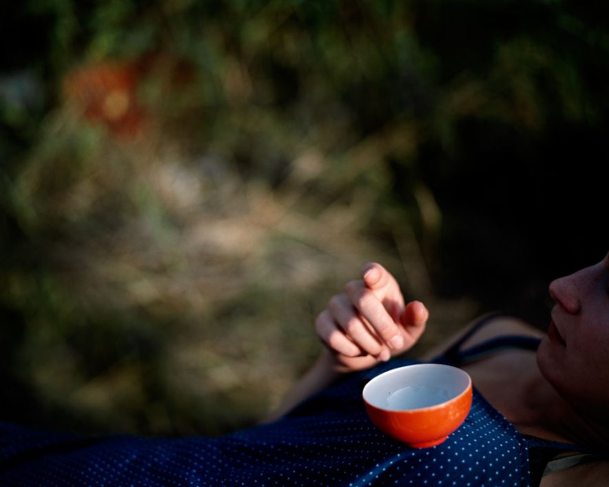
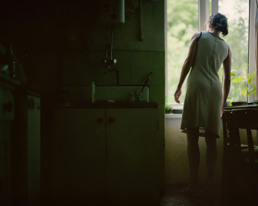
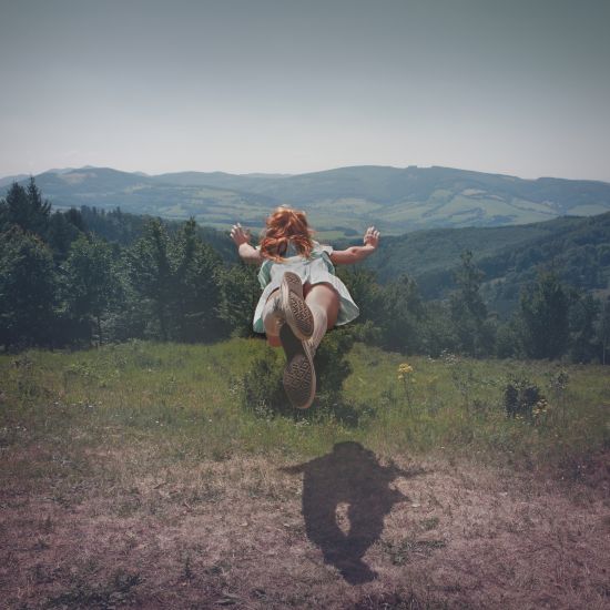
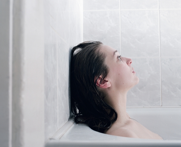
I think what I find most interesting about Davis's work is her choice of photographic moments. She makes no attempt to show herself as this significantly interesting or unique person. In fact she almost appears to go in the complete opposite direction and show herself in the single most ordinary moments possible. I think that it is all to easy to create images with the intension of reforming peoples ideal standards of beauty that are meant to show sexuality and desirability. Davis goes the opposite direction and photographs herself in situations that we all relate to from eating to waking up to bathing. In these images she shows herself as average and normal and relatable despite her weight.  You can find her work here.


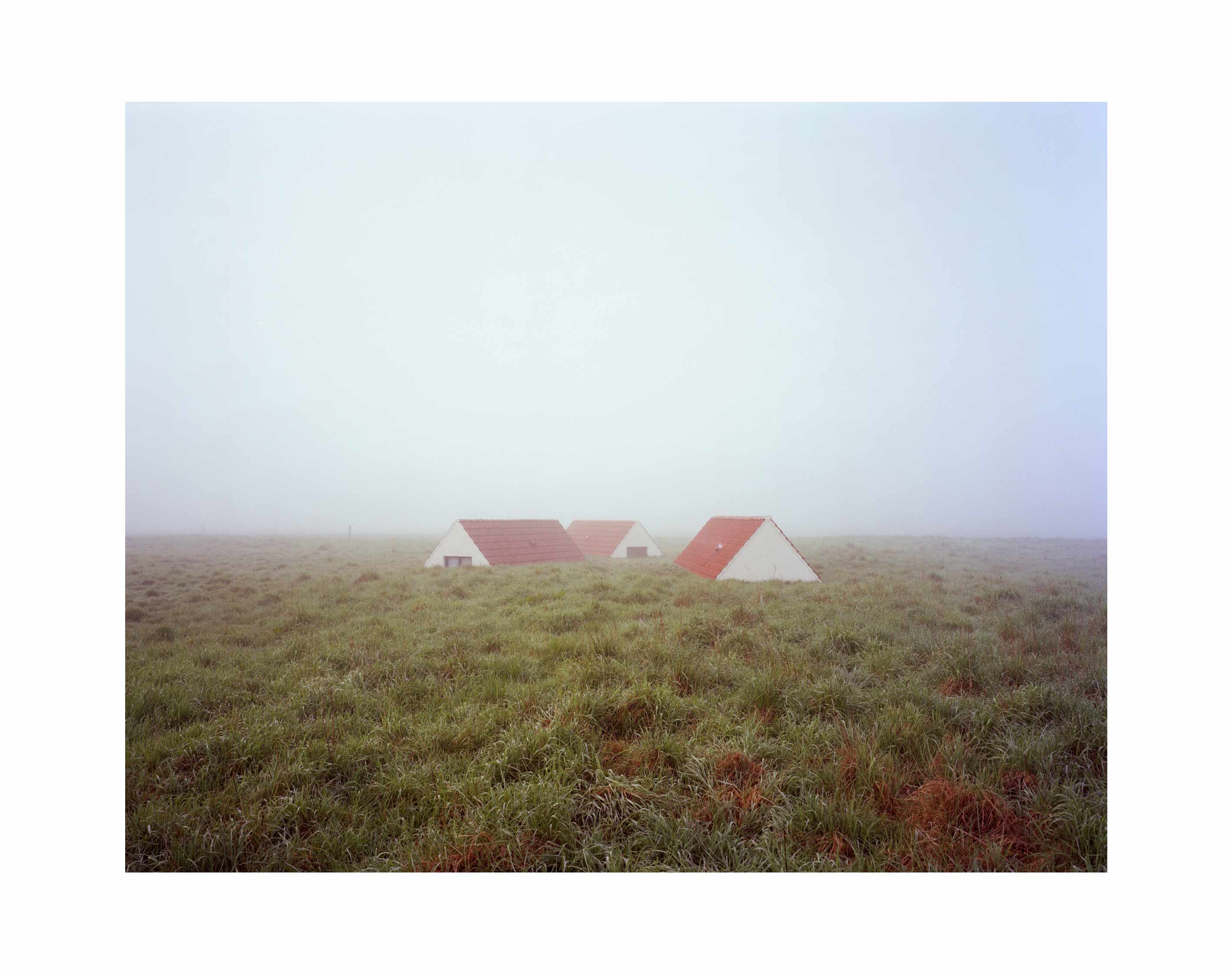
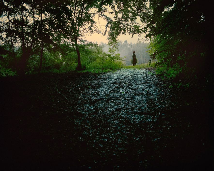
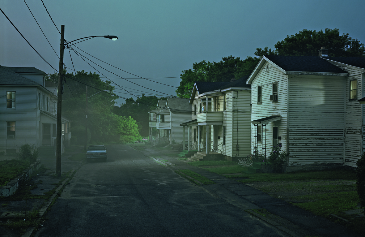
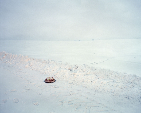
My next photographer is David de Beyter. I found his work in a book in the library that catalogues up and coming photographers.  It rook a while to find out about his actual work. Beyter is a French photographer frequently photographing how nature and man interact. His work frequently incorporates sculpture that influences his work such as the mod 60 inspired sculptures seen in his series Concrete Mirrors (not shown). I however am much more interested in the images above from his series In the Middle of Nowhere. The title itself says plenty about the work. Beyter feels this work is influenced on a future he thought about as a child and his memory of it. 

I find these images interesting for their color and composition. Beyter photographed the subject in a way that allows it to be somewhat centered and yet still interesting. He isolates it allowing only distant subject matter to come into the background thickly covered by fog or swarms it in grass. He also forces the perspective to make the viewer at eye level with the subject. These compositional elements keep an incredibly simple image visually beautiful and interesting. 


My final photographer is David Graham who's website is found here. This series is called "Immediate Future" and features young adults in their 20's. During the process of his shoot he asks them about their childhood dreams, current goals, their passions and ambition. However rather than depicting them as confident or excited or even emotional Graham shows them almost completely emotionally devoid. His sitters also look away from the viewer causing even greater tension. 

What I found most interesting is the choice of color Graham used. He used color filters when photographing causing intentional color cast. This cast of color changed the already prominent emotion of each image. It makes them appear more or less vulnerable or stoic. I found that use of color really interesting and yet still visually beautiful.


Week 15


My first photographer for the week is Anna Orlowska who's website can be found here. Her work frequently shows a cinematic quality that remind me of Gregory Crewdson who I am a huge fan of. It frequently shows some sort of narrative but an incomplete one that requires the viewer to fill in bits and pieces changing the story from person to person. While the story changes series to series Orlowska manages to keep a signature to her work. Color. Orlowska uses color that would never occur outside of a photograph and again like Crewdson feels like a movie still. While the images I choose for this blog may not represent that I found them the most appealing to me. Her images also have a great deal of visual texture. They feel real adding to the surreal and movie like quality of her work. 


My next photographer is Margo Ovcharenko who's website can be found here. These specific images are from her series "Hermitage". Ovcharenko chooses to not look for aesthetic beauty in her work but simply a way to distort time and space. She also chooses to focus on people who are between the ages of being a true adult and a teenager. Ovcharenko also states that her main style is to portray these people like pre-19th century paintings without posing them. What I found most interesting about Ovcharenko's work was that while her work avoids aesthetic beauty she choose to photograph the age group that is known as the beauty ideal. This to me seems odd. However she has stated that these people are her friends and so to her photographing them is important. She chooses to allow them to stare off into their own thoughts as if hermits in their own heads. While her images may be extremely simple or complex Ovcharenko achieves interesting images that say more about her than her subjects.


My final photographer for the week is Andrea Star Reese who's website can be found here. These images are from her project "The Urban Cave". This project documents those people who live in New York City's train tunnels. Reese goes out of her way to document them in with respect and dignity on both their worst and best days. She spent months getting them to trust her in order to have access to this other world. While the series is about those who make their homes in these tunnels she goes out of her way to keep the work about their relationships rather than how they survive. It is about showing their lives rather than survival. I could go on and on about visual texture or detail or light but honestly what attracts me to the images is the subject and Reese's efforts. Sometimes that for me is more than enough. 


Week 9


My first photographer for the week is Joel Myerowitz who's website can be seen here. I have chosen his landscape images as they are the ones I find most interesting.  His use of color is absolueltly breath taking and his use of space is extremely interesting. I found that the images I found most aesthetically appealing had a very maroon blue yellow color. They feel very surreal in some ways as if you had stepped into another world where everything is beautiful. Their is never any doubt that they are only able to exist as photographs. That to me is what makes them so successful. They only exist in this way. 


My second photographer is Veronique Boissacq who's website can be found here. Boissacq is first and for most a studio portraitist. She frequently mixes them with other object or images outside of the studio. What I found most interesting was her mixture of the two thing that visually have absolutely nothing in common. She also only chooses to photograph only young children but in a way that either appears completely innocent and child like or the exact opposite. I also found them theme of color to be throughout her work. A consistent blue cast can bee seen throughout her works. I also found that her light tended to be neutral continuing to keep the emotion of the images flat and disconnected. Her work seems to be the complete opposite of what we as artists expect. We expect emotion or thought or something below the surface but Boissacq's work appears stoic and cold. It isn't until later that you realize her purpose is to remove the identity of her subject.


My final photographer is Jakub Karwowski who's website is found here. He works as both a commercial and fine art photographer. The work shown here is his personal fine art work. It is from two series which speak about women and summer and the emotions it brings out. What I found most interesting was Karwowski's use of  perspective and scale specifically in the first and last example. He also uses light as a way to exploit these choices in his perspective. In the first image his lighting falls across the center of the image yet in the last it falls mostly to the right illuminating the main focus but allowing her setting to be seen fairly well still. Karwowski also isolates his figures fairly wall in space not allowing for extraneous details to compete for attention.

Week 10


My first photographer is Tereza Vlckova who's website can be found here. Vlckova works freqeuntly in the odd or unordinary. Many times her work lies in fantasy which matches her writing style as seen in her artist statements. Her use of color also tends to change depending on her work and how much surrealism can be found in it which is visible in the examples above. It would be difficult for me to choose a series of hers that I find was most successful. If forced I would probably say her series "Two" is most successful. It is also based less in fantasy and more in human nature. She explores the idea of loneliness and soul mates. She chooses to do so by photographing her subject twice but differently expressing either an extremely opposite emotion or only a slightly different one. She photographs them in a natural area frequently allowing them to blend ing or contact their setting. 


My next photographer is Lui Xiaofang. Xiaofang's work is also extremely influenced by childhood as well as contemporary China.  Her work features a young girl in a red scarf and white dress but without the normal cityscapes of contemporary China. She has stated this work is highly influenced by her childhood memories. What I find most interesting about this work is her choice in the circle. While it for some artists seems gimmicky and unpurposeful Xiaofang's use of it makes perfect sense. In these circles Xiaofang has created her own universe with this single inhabitant. To keep this idea she also makes her figure one of if not the smallest thing in the image and yet some how manages to make it the focus of the image. 


My final photographer is Bert Teunissen who's website can be found here. This series titled "Domestic Landscape" is about light. Specifically daylight and homes that still exist (far and few of them) across the world that are built for daylight to be the main light source. "Pre-Electricity" if you will. Teunissen chooses to photograph his subjects using panorama techniques in order to accurately depict the interior and allow them to be viewed in traditional "landscape" format. He has traveled to several countries to also see the difference in the cultural value of the houses. He poses his subject with in the room where the light interests him.  What I found interesting about them was this idea of a domestic "landscape" rather than simply calling it an interior. 

Week 13 - Portraits


The first photographer for this week is Todd Hido. As my project is on portraits of a neighborhood without the inclusion of human beings I decided for this weeks blogs to focus on photographers who I felt did something similar or choose to do it differently. Hido's houses to me are a portrait of two things. Light and emotion. Since he chooses to photograph the homes at night he loses a lot of the physical characteristics of the homes. The details are visible but to me as a viewer not the point of the photograph. The dark blue tone of this specific image make me feel cold and the single light to me feels as if Hido is documenting other people alone. As if he is the outsider recognizing the other outsiders.

To me this is different and similar to my current project. My project is a lot less about emotion (although not completely devoid of it) a change my work itself. It is more about showing a place that some people wouldn't know or think of. However I would say that Hido did find places and record them in ways people would never consider. He showed houses that in themselves many would not consider beautiful.


So my next photographer is Alec Soth. Soth is already a huge influence on my work right now. Not because of the places he photographed. My project is extremely different when it comes to location. It is extremely domestic and to some ordinary. However the way he photographs them, the attention to detail and light. The symmetry or lack of symmetry and his careful attention to it. And his color palette which completely blows me away and seems unreachable. All of these things interest me about his work. Along with that they feel like portrait rather than observations. Its not about anything other than the subject for these places. I think when doing portraiture of buildings you have to be careful in what you choose to recognize as a portrait and how to portray that for the audience. Soths careful compositions and attention to detail accomplish that perfectly for the locations. His attention to detail is also quite important. You feel a if you were standing with him there in the place. While Ithat isn't really a goal of my mine for this work I think that the detail is still important to the images. It allows the viewer to believe in the place and therefore makes it an acceptable portrait.


My third photographer for this weeks is the one and only Gregory Crewdson. I think that when people think of Crewdson they immediately think of his elaborate surreal imagery that he is so well known for. This however is another look for his. These images are from the book "Beneath the Roses" and then a book he titled "In A Lonely Place". They are very much still his work. These places wouldn't look like this with out his fog machines and careful puddle placement and giant lighting crew. However to me they are Crewdson's most believable work in color. They are geared toward showing the actual architecture of suburbia with Crewdsons well known twist of his childhood influence of psychology. 

While Crewdsons photographic process is much different from mine and his subject is entire blocks rather than a single house I feel like he is showing something similar to the goal of my project. My project is about showing the feeling and reality of where I live. It is obviously influenced by my childhood and my memories. These houses while not meant to show the negative or positive but simple truths are both physical objects and mental staples in my mind. They are my reality. Crewdsons crews and lights and machines alter the physical reality but show the mental one he sees. His work is always a large influence on mine. 


My final photographer for the day is Matthias Heiderich. Heiderich is a self taught photographer from Germany. These images are from his series "Favorite Places". I choose to use Heiderich's images for this blog because I felt that they showed to me a piece of my project that the others did not. While I am mainly photographing the domestic homes around me I am also photographing the things I use or see in my surroundings like open airfields, parks, etc. Heiderich's image to me show a lot of that as well and a key part to my project aswell. 


Week 12


My first photographer for the week is Jeff Wall. Wall is an internationally renowned photographer most well known for his large scale backlit chibachrome images. I personally prefer his work that has a vast amount of visual space and detail.  I find that the detail and space allow me to make up my own ideas or stories within each image. Walls most recent work is digital montages allowing surreal images to be created. An example is the second image titles "Flooded Grave" where Wall superimposed sea life into the watery grave.


My second photographer for the week is Anne Golaz. Not much is known about how she came to be a photographer. Her work is usually showcasing nature, people in their environment (frequently nature or hunting, natures influence, or natural items from nature photographed in the studio. I found that her color palette is frequently a blue green which was interesting due to her natural subjects and the fact she frequently shoots at night. The last two images I selected are probably the pieces of her work I find most successful. I think they are the most interesting and that the less information she gives in her work the better.


My final photographer for the week is Anne Beeke. She calls herself a photojournalist and has had her work exhibited in several museums. I chose images that I found most interesting and so they don't appear to be photojournalist because I personally am not interested in that type of work. I found her sense of space most interesting. She is frequently quite far from her subject but close enough to recognize it and see its details still. Her color is very natural and very neutral. She also uses a lot of visual texture.

Buscar


About

Mandy H - Photo I Copyright © 2011 | Tema diseñado por: compartidisimo | Con la tecnología de: Blogger