I seriously don't know what week this is...


I choose this image by Thomas Struth because of its emotional quality. I found that I am attracted to open empty areas that are normally populated by people. The loneliness of the situation really causes me to think about the emotion of the place itself rather than with other people in it.

I choose this image by Eugene Atget for it dark mysterious quality. Its no secret that I like dramatic lighting and this certainly has it. I find that it makes the photograph more interesting and yet keeps it very simple.


Photo II Week whatever it is :D

I chose Bill Brandt for my first photographer this week. I Liked the distortion of the figure. This was achieved through the distance of the arm to the body and how close the lens was to the subject. Brandts work is centered around how the camera distorts the body of the figures.


My second photographer this week is Alvin Langdon Coburn. I choose this photo for its sense of atmosphere. While the photo is clearly foggy by nature it is also foggy in subject due to the smoke. This atmosphere changes the normal street scene into something more dramatic and mysterious.
My final photographer was Brian Duffy. This photo is from a group of photographs all involving well dressed women on the street. While I didnt read any deep meaning from them I found that I really liked this one. The reflections added interest and detail while the womans gaze draws you to her as the subject.


My first photo for this week is by the photographer Bruce Davidson. This particular photograph is from his series Wales & England and is titled Wales. 1965. I chose this image for it's contrast and minimal subject. While the subject s surrounded by tons of detail it only seems to enhance the image and emotion you get from it. The image depicts a young girl in a graveyard and I feel that the way the subject was handled kept the photograph from being cliche and disinteresting. To see more of Davidson's work click here.


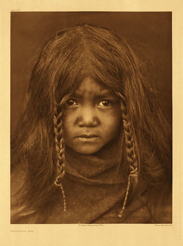
My second image is by the photographer Edward S. Curtis. Curtis was given the job of documenting Native American traditional life. I choose this particular portrait for the childs expression, the thing itself. What interested me is that while adult's in this situation consistently looked stoic and angry this child seems more uneasy than intruded upon. To see more of Curtis's work click here.


My final images for the week are from Vincent J. Stoker. The are from his series "Heterotopia" meaning "The Other Place". Heterotopia is a documentation of buildings after it's no longer going through the use of daily life and how they become a different place from their original purpose. What I found interesting is the use of light and detail from these images. I also found that Stoker's use of color also enhances the detail and subject matter further. To see more of Stoker's work click here.


The first image I choose for this week is by Sebastian Salgato. I choose this image because of its strong emotion and dramatic lighting. I really find the darkness of the image suiting to it subject matter. I also find the dusty light very visually appealing and suiting. The image depict children being sent away to keep them away from the civil war in Sudan. The emotion is clearly conveyed in the image. To view more work by Salgato click here.


My second photo for the week is a portrait is by Arnold Newman. The subject is Alfred Krupp and while the portrait is dark I can accept it. The main reason for its acceptability is that for me the most interesting part is not the portrait itself but its connection to its surroundings. Had the portrait been lighter it wouldn't have fit in. To see more of Newmans work click here.


My final image for the week is by Alpercukur. I chose this image because of its light color and atmosphere. The fog and minimal detail helps the image stay focused on the underwater path. The blur of the water also makes them more visible. The color helps separate the horizon from the ground. To see more of Alpercukur's work click here.

Photo II - Week 11


The first image I choose is a landscape from Joel Meyerwitz book Tuscany. I choose this image because I really enjoyed his use of color and space. While some might find the choice of subject boring I find that it's simplicity makes the colors the subject. It's foggy atmosphere also draws your eye into the subtle tones in the fog. To view more of Meyerwitz work click here.

The next image I chose is by Robert Mapplethorpe. It is done of his female nudes titled Lisa Lyon. While I really dislike the location of the subject and find it distracting and detracting from her form I do really appreciate the subject itself. The distortion of her body and the sculptural look are stunning. I also really appreciated the fact that her arms are missing like the many classical female nudes. To view more of his work click here.


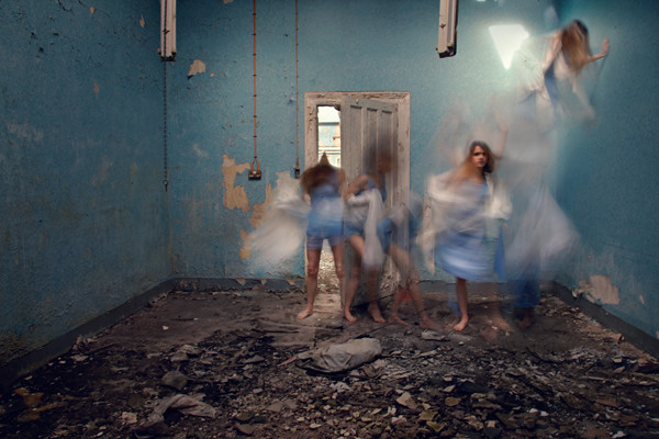
My final image for the week is by fashion photographer Elizaveta Porodina. It is part of her Light Project which features many images showing different use of light and color. What attracted me to the photo was her use of fabric color and of course light. I find the bright light to be successful especially since it changes the color of the photograph. The fabric add's interest to the photograph. The only thing I would change is the model's pose as it seems forced and too static. To view more of her work click here.

Photo II - Week 9

My first photograph is "Identical Twins" by Diane Arbus. Arbus was known for photographing the abnormal moments in people. I have always found it easy to do this with multiples. This idea has always attracted me to the idea of photographing multiple to see how easily this may or may not be and what would come of the project. What I really find successful about this photograph is its blocks of tones. The clear black, white, and grey tones are visibly blocked out into different areas of the image which creates a dynamic feeling for such a static pose. This blocking makes the other wise weak and average composition and printing successful. To see more of Arbus' work click here.


My next image is one from Rineke Dijkstra in her beach portrait series. What attracted me to this image was its simple subject and bold colors. The subject is relaxed and centered but yet clearly posed. This is even more accentuated by the direct light and clear visible background. The sense of the light is also very clearly portraiture and seems kind of off in the setting yet not so off that the viewer can't accept it. Finally the bold tones and bright warm color in the middle of a cool toned setting makes the image pop even further. To view more of Dijkstra's work click here.


The final image for this week is Route 14, New Mexico. It is part of a series titled Stranded by photographer Amy Stein. The series is about the corruptions in American government post Hurricane Katrina. Stein spent five years working on this project as she traveled across the US to photograph broken down cars. During this time she marked each location on a Google Map which you can visit here. The cars are both symbolic for the American destiny and literal for their breakdowns. What I found most attractive about the photograph itself was its sense of atmosphere. The viewer clearly recognizes that haunting feeling of being lost and broken down on a creepy and eerily generic road. I think the thing that makes this so clear is its ambiguity in location. The viewer can put his or her own experiences on the photograph without being deterred by road markers, license plates or anything that is distinct of a specific area. To view more of Stein's work click here.

Photo II - Week 8


My first photograph for the week is "U.S. 90, en route to Del Rio, Texas" by Robert Frank. What I liked about the photograph was it's sense of space and awkward balance. Not only does the car take up most of the pace in the frame but the interior or the car is full and leaves the view with a claustrophobic feeling. I think that the little space of the scenery is extremely important. The distance in the background and the winding road give the feeling of travel and without it the image would seem more like living in your car rather than traveling across a distance. I found this image in Artstor.


My second image for the week comes from William Eggleston's book William Eggleston. What drew me to the image was the mystery of the subject. While its clear that it's a woman in a restaurant you cannot truly see who she is or what she looks like. Along with that as in all Eggelston color photographs the colors are extremely vibrant and make the photo even more interesting. The viewer may feel like they could know this woman or have seen her some where just from knowing her skin tone or hair color. To view more of Eggelston's work click here.


My final image for the week is Bonneville Salt Flats, Utah by Rob Hann. Rob Hann is an English photographer that seems to specialize in photographing the things he finds during his travels. One of the few thinks he has done is photograph a convention in the Bonneville Salt Flats. This is one of the images from that series. While it may appear set up the reality is that he was merely photographing what he saw at the convention. The photo appeals to me for is light, clear tones, and beautiful colors. To view more of Rob Hann's work click here.

Photo II - Week 7


The first photo I choose this week is "Pacific, Devil's Slide, California" by Minor White. What I found most interesting about the photograph was the light. I felt like the light in the image was fairly intense and yet there was only one single cloudy light source. I also was interested in the textural quality that the light brought out in the water. To see more of his work click here.


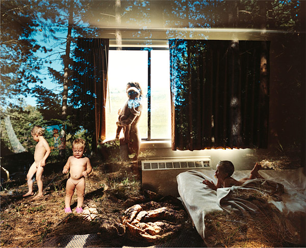
The next photograph that I choose is "Overnight" by Mark Klett. I have been really interested in the idea of photographing passing time since seeing Sugimoto's work and I think that is what caused my interest in this work. The photograph depicts what happens in a single area, a single bed, for a night. That idea and the beauty of the image itself is extremely successful in my opinion. To see more of Kletts work click here.


The final photographs I have chosen is a self-portrait of the artist herself Alexa Meade, an in process photograph, and my personal favorite work of heres titled Nocturne. Meade creates her work by selecting models and then painting the subject to match what she sees. At times that subject is within an interior to add to the interest of the final image. These paintings are then photographed. What I found most interesting was that it doesn't appear to be that Meade focuses on one aspect more than the other. The construction of the image is not more important that the image itself. To view more of her work you can visit her webpage here.

Photo II - Week 6


The first image I choose is Coast near point Reyes, California by Ansel Adams. I chose this photograph because while it involved landscape it felt much more like a skyscape. I think what makes this photo successful is the mimicking of landscapes shape in the clouds. They both form a a c shaped curve that is very successful. Adams use of the zone system also created a tonally balanced image so that it had all the detail of the landscape without loosing the glow of the sky or clouds. I found this image on Artstor.


The next image I selected is by Harry Callahan. It is titled Eleanor and Barbara (baby carriage) and is a silver print from 1952. While the subject matter of a child and her mother is always beautiful to me I also really enjoy the image for what it looks like as well. Callahans use of point of view forces the viewer into curved path and back out in a calm way that feels natural and genuine. This feeling then carries on due to the calm of the subject themselves. While the image itself is dark it still has plenty of detail to add to its beauty. To see more of Callahans work click here.


The final image for this week is Blowing Bubbles by Sally Mann. It is a featured part of her book "Immediate Family". The dramatic lighting is what draws me into the image. Once pulled in the viewer bounces around first looking at the children and then to their cultured surroundings. The selective focus for the image also helps the viewer to notice these things as well. However when it comes to the subject I feel that the childs direct gaze helps the image. Had she been turned around with her sister I don't think it would hold the same feeling. To view more of her work you can visit her website here.

Photo II - Week 5

My first photograph this week is by E.J Bellocq. I think what I found most interesting about it is its calm quiet nature. Bellocq was known for photographing many prostitutes and allowed them to dress how the wanted and to be seen how they wanted to appear. Many of his photographs have the same calm quiet that can be seen here while others appear much more matter of fact. While the subject matter is simple it is portrayed in a way that brings much more interest and reveals a side of these women that most people never really saw. To see more of his work you can visit ARTstor which is where I found this photograph.


During critique this week Ron had told me that it looked like I had photographed with Meatyard in mind and so I decided to go and search for what he was seeing. While I came across a large amount of masks and blurred arms I found this particular photo my favorite. I thought that it depicted the emotion of the child well. After photographing children for a while I have come to recognize that face quite well. However it was the childs use of the props that made the photograph for me as well as his feet. The way he pokes the doll with the flag and looks away and crosses his feet read boredom and childhood so clearly. It just feels genuine. To see more of Meatyards work you can visit ARTstor which is where I found this image as well.


My final photograph this week is by Tierney Gearon. It is part of her series titled Explosure in which she double exposes her film in camera and then prints them straight with no retouching. Tierney is a recently discovered artist (discovered in 2001 for her series "I Am A Camera") who has now produced 3 exhibitions, Explosion being the most recent. What attracted me to this photograph was its double negative quality. While I am not exposing my negatives twice this week I am hoping to achieve a similar look in my work. To see more of her work you can visit her website here.

Photo II - Week 4


The first photo I selected for tis week is by Hiroshi Sugimoto. It is titled Colors of Shadow C0126 and is part of the collection "Colors of Shadow". Sugimoto had the area covered in a Japanese plaster that absorbs light evenly and then waited for pleasing results. I think what most attracted me to the photo was its light colors. The photograph could easily be a black and white and yet he choose to use color. The colors for me are possibly as interesting as the shapes of the shadows. To see more of Sugimoto's work visit the website here.


The next photograph is by Lisette Model. It is titled Sailor & Girl, Sammy's Bar, New York. The photo is one of the many that Model took in New York City. She frequently shot photographs of people conveying sad emotions such as loneliness. This opposite feeling is what drew me to the image. If Model's aesthetic was lonely sad people why take this photo? At the time did it seem safer or was it just an attractive subject? The print is from the 1940's. To see more of Model's work you'll have to do some searching as it was very difficult to find online. This image is from ARTstor.


My final photo for the week is by Sacha Goldberger. I couldn't find out much about this photograph other than his model who happens to be Goldberger's Grandmother. I think that while the humor of the photograph make the image strong its composition and cool colors make it even more successful that just the "thing itself". To view more of Goldbegers work click here.

Photo II - Week 3


The photograph above is "New York City" by Helen Levitt. Levitt was known for her photographs of New York City and the children there. As I was looking through her photographs I found myself drawn to this specific photo time and time again. The awkward angle of the girls body and it's organic shape next to the very geometric car was a combination I found visually compelling. The fact that Levitt captured a moment that all children experience at some point in such an abnormal looking way only makes the image more interesting to me. The use of a fast shutter speed would be required unless she placed the child there however that would defeat the purpose of her candids. It appears to be that finding Levitt's work online can be difficult however, as DCAD students you can view more of her work on ARTstor.


The first photograph is Untitled work by Cindy Sherman. Sherman is the model for the photograph however she disguises her appearance with a few simple tricks such as wigs and makeup to create memorable characters. Sherman refuses to title her works or put them in any sort of context. While the photograph itself doesn't appeal to me I find Sherman's simple creativity and position on her art refreshing. Sherman's art was difficult to locate. Her personal website which can be viewed here has some work but ARTstor has a much larger selection.


My final photograph today is by Julie Blackmon. The photograph is titled Birthday Girl and is featured in her book Domestic Vacations. The photographs are inspired by both Blackmon's experience as a child being on of 9 children and as a mother of three. The book is also inspried by the Dutch proverb a Jan Steen household meaning a house of chaos. While I cannot say for certain I am almost certain that Blackmon digitally composites her photographs. I can honestly say that I find everything about her photographs appealing from the colors to the light. You can view more of the work on her website here.

Photo II - Week 2


The above photograph is titled "The Wanderer" and was taken in 2003 by Loretta Lux. The photograph is one of the many surreal children's portraits that Lux is known for. While many of her works have a very obvious feeling of cut and paste to create the surralisim this particular photo lacks that feeling. It's transition from background to figure is much more smooth than Lux's usual style. That lack of seam is what attracts me to this photo however. I find the believability to be incredible and highly interesting. One can assume that Lux photographs her subjects in their unusual costumes in one location and then composites it into the background. However I am unable to say wether she does this in photoshop or in a darkroom. To view more of her work you can visit her website here.


This photograph is titled "Adolf Bolm Ballet Intime Dancers" and was taken by Imogen Cunningham in 1921. What I find most attractive about this photograph is the use of the scale and space. While the dancers are meant to be the main subject their scale is so minute that your eye is first drawn to them and then, even with the front dancer pointing, your eyes are drawn up and out of the frame. In order to create the photograph Cunningham would of course have to watch her composition but also her aperture. The depth of field of this photograph is also important. In order for the dancers and their surroundings to be in focus Cunningham would have to use a long depth of field and a narrow aperture. To view more of her work you can visit her site here.


The final photograph for this week is titled "Revelations" and was taken by Jill Greenberg in 2005. This photograph was taken for part of a series Greenberg did called "End Times". The series was meant to show the raw emotion of children (none of them were harmed in any way in order to get the desired photograph) and a mothers fear for her own children's future. The photograph was clearly taken in a studio environment and its tonal ranges pushed to the desired effect. Wether Greenberg chose to use film or digital to record the photos I do not know. To view more of her work you can visit her site here.


This photograph was taken by Lauren Greenfield who is a photojournalist. Greenfield tends to photograph subject that depict a specific idea of human behavior. The following image is of 4 year old Allegra playing dress up. I believe the image was used in Greenfield’s book Fast Forwardwhich depict children growing up under the influence of Hollywood in California. What I find interesting about this image is just the purpose it was captured for but that it’s meaning can be seen without Greenfield’s captions or ideas being added onto it. The image conveys the exact idea. In order to create the image it appears Greenfield used natural light however, it seems that light wasn’t bright enough to use a fast shutter speed and an aperture that would capture the items Allegra was trying on. Therefore it appears that Greenfield used a slower shutter speed to get the depth of field she wanted without compromising sharp focus on Allegra’s face. To see more of her work you can visit her website here.

Jerry Uelsmann is a photo manipulation photographer known for his surreal images that he crafts in his personal darkroom. First to discuss what attracts me to the image I find the mixture of textures and the dramatic lighting very beautiful. The texture of the gritty sand against the smooth walls is something that I find really incredible, mainly because it is so believable. While most photographs are of things that are already existing Uelsmann takes random photos that he processes and find ways to mesh them seamlessly. While I do know some of his process I highly recommend looking into a book we happen to have in the library titled “Uelsmann: Process and Perception – Commentary and Photographs”. The only thing I can say with any confidence in order to get this photo was to create masks from black paper to create harsh edges. To see more of his work you can go to his website here.


The following photo is by Benoit Paillé. While I know less about his reasons behind his photography I have found myself frequently inspired by his work, specifically his Rainbow Gathering work. The photo above interests me because both the rarity of a photo from these types of gathering and because of its clean and crisp feel even though the subject is standing in a wood filled area covered in paint. While I don’t know much about how the photograph was taken I can say that I am almost certain it was taken in natural light using a digital camera. Paillè also admits to editing his photographs out of camera so I can assume that he did so with this image. To see more of his work you can visit his website here or his flickr.


Dreams

Natalie Dybisz . 2009 . Her Fleeting Imprint

The first photograph I've chosen is by Natalie Dybisz. You can see her work here. I choose this photograph because I felt that when you look at it you get a very surreal and dream like feeling from it. I find all the little details in her setting to add to that interest as well as her idea of multiplicity. I also find her use of light very nice. While the image is bright and clear her light source is neatly tucked away into a corner where you can barely see it. Her use of movement and color also continue to add interest and and detail.


Brooke Shaden . 2011 . Ships in Dry Land .

The next photograph I selected is by photographer Brooke Shaden. You can see more of her work here. Brooke creates mainly surreal/ dream like photographs and there for I felt like I had to use her. Choosing one photo was very hard and I recommend looking at all her work to get a true idea of her style. Moving on, I chose this photograph because I liked its sense of value . It draws a fair amount of attention to the subject without loosing the background. I also liked that the narrative was simple but still very effective and that the models face was hidden. I think that its simplicity keeps things from getting too cluttered and hard to read.
Rebeca Carpintero . 2010 . Wake up, Leave Body

The last image is by Rebeca Carpintero. You can see her work here. I chose this photograph because I felt that while it was simple it has a great amount of impact. First her setting is lit using daylight (something I happen to favor) which created a soft white wash to her colors. This for me creates a welcoming space to view. However it is quickly disturbed by the image of the subject's soul pulling out of her body. I liked the way it was portrayed because it was something anyone with any camera or computer could do. It was a simple double exposure, but rather than being boring or overly complicated it's simple and effective. Finally we come down to a crackled texture on the ground left with and erie broken feeling.

Abstraction

Dojoh . Frozen Flame

The first photograph is by a photographer who goes by the the name Dojoh. You can view his work here. I chose this photograph because I felt his use of point of view creates a surreal and abstract composition of the architecture he was photographing. His POV create strong geometric lines that pull your eye all the way through the image.


Ahmedpho . March 15, 2010 . Abstraction

The next photograph is by a photographer by the username Ahmedpho on Flickr. You can view his work here. I chose this photograph because I felt it was a good representation of current abstract photography. It has a strong geometric composition and a very mathematical feeling. It's not really my favorite but I do like it. My favorite thing about it is the colors. I like that pop of blue surrounded in grey, it draws the eye in and then the lines take you up.

Scott D. Butcher. February 17, 2010 . Untitled

The final photo is by the Photographer Scott D. Butcher. You can see his work here. I chose this photograph one because I like how vibrant the pink hue is and two because I felt it was a good Idea of my style of abstract photography. I find the simple close up macro of this image really interesting. The simplification of the form makes it abstract.

Buscar


About

Mandy H - Photo I Copyright © 2011 | Tema diseñado por: compartidisimo | Con la tecnología de: Blogger